Thursday, August 6, 2009

color perception and context... (AKA optical illusions)


I've talked about this in class, and this is simply the coolest example of it I've ever seen. The punch line is that the green color and the blue color are actually the same. Don't believe it? Open it in Photoshop and read it, using "Info", or just use DigitalColor Meter on your Mac.

The site it came from is pretty cool, too, Color Illusion 12, here.

Labels: , ,

Thursday, January 29, 2009

site- List of Color Management Myths


This is a great list of Color Management Myths from the ColorWiki- the folks who make ColorThink, the software that the core idea of Color Pipeline is built on... not only the myths themselves, but little explanations of the truths.

Site here.

Labels: , , ,

Saturday, June 14, 2008

preview: the Color "Path"

...here's a little tease for you. The Color Pipeline is built around a revelation I had one day in the wee hours of the morning... colors follow a "path" through the process of capturing, editing and printing a photograph, and if we could track that path we maybe could understand it a little better, and control the colors a little more, well, effectively.

From that idea grew the Color Pipeline... and credit is due to Joe Holmes, Nick Wheeler and Michael Oh in patiently holding my hand along the way.

This diagram grew from my original chart, pretty much scribbled on a napkin. It shows the track of colors, what happens in each step, and how the colors "connect" from one phase to the next. Kara is adding captions, and it will be a little clearer, but this is the core idea. (We're talking about making a board game of it... remember "Candyland"? ..."Colorland", maybe? stop me before I kill again!)

Click on the image for a bigger version... and check back for the game show!

Labels: , ,

Sunday, May 25, 2008

review: ColorMunki Photo (part 4, summing up)


So, finally, what do I think of the ColorMunki?

Well, I think it's a good start. It's a good start for XRite, putting together a new package that makes Color Management easier (but the printer profiles are not there yet). It's a good start for someone trying to get their system color managed with a minimal effort and equipment (but the printer profiles aren't there yet...)

The interface is the best I have seen, and I'm pretty sure I've seen them all. The display profiles are great, and, if you have a need for them, the bundled software, specifically the Photo ColorPicker, may be worth the price all by itself.

Would I run out and buy it? Not until the printer profiles look better. Unlike the Huey, this is cool AND does a good job on your display, but, honestly, when the i1 DisplayLT is selling for under $200, I can't really see the Munki being worth the $500 tag. It kind of reminds me of Aperture when it was first released. It was pricey, hard to understand, took a lot of effort to see how it fit into the puzzle of my workflow, and, it had a couple of real fatal flaws.

Maybe v2. Check back later.

Labels: , , , ,

Sunday, May 11, 2008

review: Photo ColorPicker Overview

This is a pretty clear explanation of what Photo ColorPicker is all about... from the Munki Help site.

Photo ColorPicker empowers you to create and share your own palettes, and synchronize them with commonly used applications. Select colors from many sources: included Munsell and PANTONE® color libraries, color measured with your ColorMunki device, and colors extracted from your images. Preview palette colors using PrintSafe. Synchronize palettes across Adobe® Photoshop®, Illustrator® & InDesign®, and QuarkXPress®. Share your palettes with others using a variety of formats.

Consider that whether you're a photographer, graphic designer, or other content creator, you are increasingly responsible for project design and content considerations, in addition to the photos that will be used. For a particular image, or set of images, you can build palettes based on colors in those images, and have related colors suggested. Then build a custom color scheme for a web site, or design layout, as a color palette, and have it synchronized with your applications. Or export the palette in a multitude of formats to share and collaborate with others.


While I'm at it, DigitalPouch is explained here:

DigitalPouch allows you to communicate and share color accurate images. Each DigitalPouch file contains images of your choice, an associated ICC profile (used to describe the colors in your images), and a lightweight, color managed viewing application. You can send DigitalPouch files to others and they can view your work color accurately by simply opening the DigitalPouch file.

Labels: , , , ,

Saturday, May 10, 2008

review: ColorMunki Photo (part 3, other stuff)


This is really cool. Not for a minute will I pretend I know much about this, but it's one of the two extras that you get with ColorMunki Photo- The Photo ColorPicker. It looks like a killer tool for looking at, understanding, and even cataloging and organizing color relationships. It certainly bears some more research. Note that it also syncs with your Lightroom or Aperture Libraries.

You also get this thing called the DigitalPouch, which I can't really see the purpose of... Looks like another Library, maybe if you're not using Appy or LR you'd use this? I think they bill it as sort of a color managed folder... I'll have to look into it more.

And, of course, you get projector profiling, not something I've spent much effort on, or had much luck with, frankly. Mostly because most projectors, even good ones, are just plain bad. (What's the expression? Polishing a turd? eeeew.) But still, a nice feature. If you have it, you can try it. Try it, you might like it.

Labels: , , ,

review: ColorMunki Photo (part 2, printer)

Here is a look at the process of building a printer profile with the Munki. They've done a great job walking you through every step... even including a timer to get you to let the ink dry down before you measure it.

Take a look...


This is the first target... it's very basic, measures easily and quickly...


This is great. A timer. Purists, like Bill Atkinson, will dry a test target down for almost two weeks... but the ten minutes at least keeps the ink from smearing, when you measure it.


Here's the second step... the first target is used to generate a second set of patches. These second patches allow the program to fine-tune the primary color readings, sort of like smoothing out the rough edges, mathematically.


This is the second target.

This two-phase process is trying to simplify the steps and make it faster and easier. I'm not sure, but I think it is the same process as what you get on the big HP printers, like the Z3100, with the on-board profiling (also an XRite product).

It really is a great process. I've used the old Kodak system, Monaco, and of course, i1 Match, and they keep on getting better. Back in the day, you'd be measuring a great stack of patches, and the software would error out, and you had to start over at the beginning. It, well, sucked. The Monaco Pulse was the first system that was, actually, well, kind of fun. I always liken it to agitating film... sort of soothingly repetitive. This software is clearly an evolution of that.

The only question is... can we do any better on the performance of the profiles? It's a great process, I just don't see the results. Before I come to any conclusions, I'm going to see if I can get to the bottom of these profiles, and see if it is just how they are, or if it's something I'm doing wrong.

Labels: , , ,

review: The Munki print profiles


on the left, the Munki. on the right, a box-stock Epson profile (Premium Gloss)

I've done it 3 times, same result... Munki profile is saturated, blocked up shadows, really yellow skin tones. What you see here is pretty close to the truth.

Sorry Munki. Not too impressed.

Labels: , , ,

Color Managed printing in Leopard (Epson)

OK they have changed the Epson printer drivers in Leopard, and combined the "Print Settings" and the "Color Management" windows. For assigning the profile in Photoshop, just select "Color Management" and pick "Off".

Here is the Photoshop side...


...once you hit "Print", you go to the Epson drivers:


Labels: , , , , ,

Friday, May 9, 2008

review: ColorMunki Photo (part 1, display)


Well, XRite got me the Munki to test... woohoo!

I started out, today, by doing a simple display calibration. Essentially, the Munki has the same controls and easy interface as XRite i1 Match. A few controls, such as where, and what name to save the profile under, are missing, but otherwise it's a nice clean process. Screen shots are below... as well as a ColorSync Utility comparison of the display profile made by the Munki (shown in full color) and one made by i1 Match and the really big, expensive XRite system (shown as white "frame").

The device itself is really kind of nice. All self-contained, and unlike the low-end systems, it does do a baseline calibration of itself.

One issue, the "install" disk is really just a shortcut to a 165mb download. Good luck if you don't have a high-speed connection.

I'm going to run some printer profiles today and post those results... I'll also post all of the actual profiles so you can tear them apart yourself.


Labels: , , ,

Saturday, March 15, 2008

Understanding How Rendering Intents Work

(...an excerpt from the coming book, "Color Pipeline", coming this Fall)

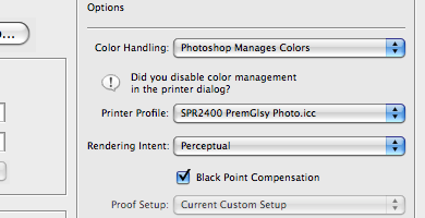
Rendering Intents are, essentially, the logic used in remapping color into a smaller color space. The two basic rendering intents that we are dealing with are Perceptual and Relative Colorimetric.

Perceptual intent presumes that you want to keep the relationships between all the colors, that is, if you have colors that appear different, we want to keep that appearance when they are remapped. Converting colors with Perceptual Intent requires that we move all the colors in the space around a bit. I like to make an analogy to a sponge, or a balloon. Perceptual intent kind of squishes the sponge up, and the entire sponge changes shape a little.

Relative Colorimetric intent is more of a cookie-cutter effect. If colors are outside of the smaller space they are moved to the closest color inside the space. All the colors inside the space remain untouched. If, in the conversion, the colors being remapped lose their relationship to each other, that is, lose their “spacing”, well, so be it.

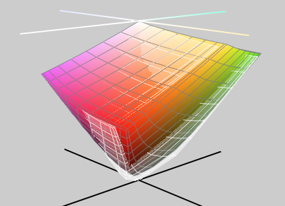
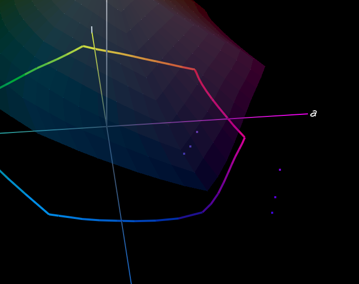
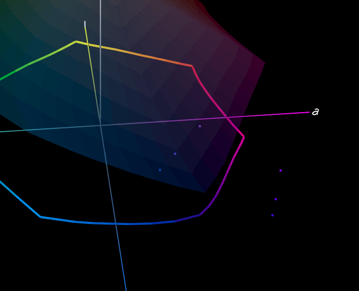
Here are some examples. I went back to our color burple, and made a couple of other colors… blue, burple and purple. Here they are, sitting well outside the Epson Premuim Luster color gamut (shown very lightly shaded).

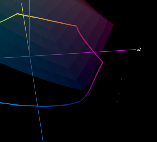
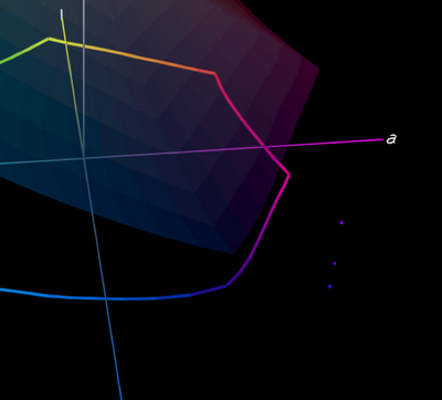
The next illustration shows the three colors mapped into the gamut of Premium Luster using Perceptual Intent. You can see that the distances between the three are almost exactly the same, and they’ve been moved around a little. This is to maintain our perception of them, and their relationship to each other.

The final illustration shows the same colors mapped in using Relative Colorimetric Intent. As you can see, they are closer together, they are mapped directly into the gamut just to the nearest available color, with little concern for maintaining any relationship between them.

So when do you use which one? Keep in mind that with Perceptual Intent everything gets changed… Relative Colorimetric, only the colors that need to change get changed. There’s your answer.

You use Perceptual Intent when you need to make some big changes in your gamut, and the “look” of the colors is important. For example, if you have a full, rich blue and purple image and you are printing it to Premium Luster you may want to use Perceptual Intent so that the colors will print with the same differences and “spacing” you’re seeing in AdobeRGB, but get mapped into the colors that the printer can work with.

Relative Colorimetric Intent is really handy when, for the most part, all of your colors are inside the printer gamut, and only a few, like our burple, aren’t playing nice. We don’t need to push everything around just to get burple in there, we just need to push it in, and leave everything pretty much as it sits.

This is a great case of, if you know where your colors fall, and you know what your gamut is, you can make the best choice about how the system is going to convert the colors and keep as much of the image intact.

Labels: , , , ,