Sunday, May 25, 2008

review: ColorMunki Photo (part 4, summing up)


So, finally, what do I think of the ColorMunki?

Well, I think it's a good start. It's a good start for XRite, putting together a new package that makes Color Management easier (but the printer profiles are not there yet). It's a good start for someone trying to get their system color managed with a minimal effort and equipment (but the printer profiles aren't there yet...)

The interface is the best I have seen, and I'm pretty sure I've seen them all. The display profiles are great, and, if you have a need for them, the bundled software, specifically the Photo ColorPicker, may be worth the price all by itself.

Would I run out and buy it? Not until the printer profiles look better. Unlike the Huey, this is cool AND does a good job on your display, but, honestly, when the i1 DisplayLT is selling for under $200, I can't really see the Munki being worth the $500 tag. It kind of reminds me of Aperture when it was first released. It was pricey, hard to understand, took a lot of effort to see how it fit into the puzzle of my workflow, and, it had a couple of real fatal flaws.

Maybe v2. Check back later.

Labels: , , , ,

Sunday, May 11, 2008

review: Photo ColorPicker Overview

This is a pretty clear explanation of what Photo ColorPicker is all about... from the Munki Help site.

Photo ColorPicker empowers you to create and share your own palettes, and synchronize them with commonly used applications. Select colors from many sources: included Munsell and PANTONE® color libraries, color measured with your ColorMunki device, and colors extracted from your images. Preview palette colors using PrintSafe. Synchronize palettes across Adobe® Photoshop®, Illustrator® & InDesign®, and QuarkXPress®. Share your palettes with others using a variety of formats.

Consider that whether you're a photographer, graphic designer, or other content creator, you are increasingly responsible for project design and content considerations, in addition to the photos that will be used. For a particular image, or set of images, you can build palettes based on colors in those images, and have related colors suggested. Then build a custom color scheme for a web site, or design layout, as a color palette, and have it synchronized with your applications. Or export the palette in a multitude of formats to share and collaborate with others.


While I'm at it, DigitalPouch is explained here:

DigitalPouch allows you to communicate and share color accurate images. Each DigitalPouch file contains images of your choice, an associated ICC profile (used to describe the colors in your images), and a lightweight, color managed viewing application. You can send DigitalPouch files to others and they can view your work color accurately by simply opening the DigitalPouch file.

Labels: , , , ,

Saturday, May 10, 2008

review: ColorMunki Photo (part 3, other stuff)


This is really cool. Not for a minute will I pretend I know much about this, but it's one of the two extras that you get with ColorMunki Photo- The Photo ColorPicker. It looks like a killer tool for looking at, understanding, and even cataloging and organizing color relationships. It certainly bears some more research. Note that it also syncs with your Lightroom or Aperture Libraries.

You also get this thing called the DigitalPouch, which I can't really see the purpose of... Looks like another Library, maybe if you're not using Appy or LR you'd use this? I think they bill it as sort of a color managed folder... I'll have to look into it more.

And, of course, you get projector profiling, not something I've spent much effort on, or had much luck with, frankly. Mostly because most projectors, even good ones, are just plain bad. (What's the expression? Polishing a turd? eeeew.) But still, a nice feature. If you have it, you can try it. Try it, you might like it.

Labels: , , ,

review: ColorMunki Photo (part 2, printer)

Here is a look at the process of building a printer profile with the Munki. They've done a great job walking you through every step... even including a timer to get you to let the ink dry down before you measure it.

Take a look...


This is the first target... it's very basic, measures easily and quickly...


This is great. A timer. Purists, like Bill Atkinson, will dry a test target down for almost two weeks... but the ten minutes at least keeps the ink from smearing, when you measure it.


Here's the second step... the first target is used to generate a second set of patches. These second patches allow the program to fine-tune the primary color readings, sort of like smoothing out the rough edges, mathematically.


This is the second target.

This two-phase process is trying to simplify the steps and make it faster and easier. I'm not sure, but I think it is the same process as what you get on the big HP printers, like the Z3100, with the on-board profiling (also an XRite product).

It really is a great process. I've used the old Kodak system, Monaco, and of course, i1 Match, and they keep on getting better. Back in the day, you'd be measuring a great stack of patches, and the software would error out, and you had to start over at the beginning. It, well, sucked. The Monaco Pulse was the first system that was, actually, well, kind of fun. I always liken it to agitating film... sort of soothingly repetitive. This software is clearly an evolution of that.

The only question is... can we do any better on the performance of the profiles? It's a great process, I just don't see the results. Before I come to any conclusions, I'm going to see if I can get to the bottom of these profiles, and see if it is just how they are, or if it's something I'm doing wrong.

Labels: , , ,

review: The Munki print profiles


on the left, the Munki. on the right, a box-stock Epson profile (Premium Gloss)

I've done it 3 times, same result... Munki profile is saturated, blocked up shadows, really yellow skin tones. What you see here is pretty close to the truth.

Sorry Munki. Not too impressed.

Labels: , , ,

Friday, May 9, 2008

review: ColorMunki Photo (part 1, display)


Well, XRite got me the Munki to test... woohoo!

I started out, today, by doing a simple display calibration. Essentially, the Munki has the same controls and easy interface as XRite i1 Match. A few controls, such as where, and what name to save the profile under, are missing, but otherwise it's a nice clean process. Screen shots are below... as well as a ColorSync Utility comparison of the display profile made by the Munki (shown in full color) and one made by i1 Match and the really big, expensive XRite system (shown as white "frame").

The device itself is really kind of nice. All self-contained, and unlike the low-end systems, it does do a baseline calibration of itself.

One issue, the "install" disk is really just a shortcut to a 165mb download. Good luck if you don't have a high-speed connection.

I'm going to run some printer profiles today and post those results... I'll also post all of the actual profiles so you can tear them apart yourself.


Labels: , , ,

Sunday, May 4, 2008

G9 test shot


Ok here you go.

This board setup has brought cameras to their knees, and this camera ROCKS it. I shot it at ISO 80, f5.6 at 1sec, hot lights. Not the optimum, but I don't have the hot-shoe pc adapter to shoot it with my strobes yet.

The jpeg is here, and the RAW file with the XMP file is here. (13.6mb)

(Please show it to whoever you want, but credit this site. It is copyrighted. I will send my spiders to get you...)

Labels: , , ,

cameras: Canon g9


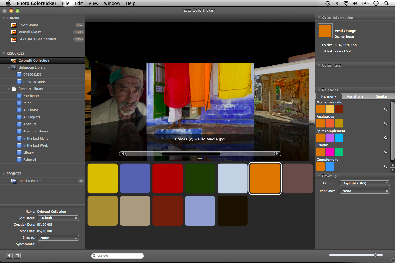
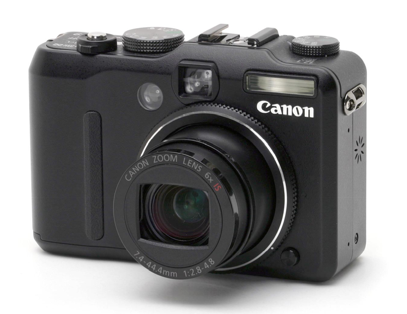
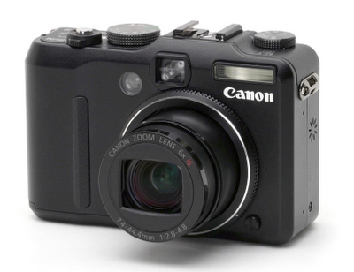
Well, I just have to gush about a camera today. I picked up a Canon G9 a little over two weeks ago. I can’t say enough good stuff about it.

First, and most important, the RAW files are incredible. At ISO 100, at 180ppi they print at 16x20”. The noise at higher ISO is probably not as good as a similar-price ($500) DSLR like a Nikon D40 or something, but it’s acceptable, and better than 35mm film. The color accuracy right into Camera RAW rocks, and I’m starting to LOVE the SD cards… a 2GB SD card is $15.

Frankly I bought this camera so I’d have a RAW-capable camera with me at all times… I have 2 more books under contract, and I need to provide about 250 images per book. I have to take my own advice: shoot your butt off.

More than that, this camera has brought me back to the days when I used to carry a camera with me rock-climbing, mountaineering and backpacking… my dream was to have a pocket-sized 2 ¼ format camera, an impossibility with film, even with folding models.

The camera I fell in love with was the Olympus 35RC… a semi-automatic rangefinder point-and-shoot, and even the Leica CL didn’t match up to that camera, for what I needed. The G9 is every bit as perfect a solution, with file quality that surpasses most 2 ¼ film. And this is not a claim I make lightly.

And here is the surprise. The LCD viewing screen is my new obsession. Why? Composition.

One of the things you learn when you shoot with a “ground-glass” camera like a 4x5 view camera, a twin-lens reflex or an SLR like a Hasselblad, is that the ground-glass gives you a nice little picture… almost a preview of the photograph. You don’t get lost in the viewfinder, whether it be a rangefinder or a prism, you see this nice little 2-dimensional frame of your image. Except, of course, it’s usually backwards, upside-down or both. The LCD on the G9 does exactly the same thing… it’s just like viewing a ground-glass, except the image is right-side up. It also has a histogram on it, if I want, as well as all sorts of other information. The LCD allows me to see my composition, and visualize my photograph, real-time, with the actual aperture (so I can see the depth of field).

Once I made the adjustment to this radically new way of shooting with a digital camera, yet one firmly rooted in tradition film shooting, I was out of control. I just love it. Beyond that, I can’t really see much through most viewfinders these days… since my glasses it’s just never been quite the same. Heh…

Finally, (and I don’t add this lightly… this is one of the most important factors in choosing a camera), the thing just feels and looks sweet. It has even more of a solid feel than that old Leica CL. It’s metal. It has knobs. This is important, frankly, because if there is one thing I learned from the years I worked selling cameras, it’s that us photographers simply like working the machinery, almost as much (and more, in some cases) than taking pictures. If you’re trying to decide between two cameras, I’ll always tell you to pick the one that feels best to you.

I’ve intentionally stayed away from product reviews and endorsements on this site, but I just can’t stop myself on this camera. It gets my highest form of praise: a resounding “SWEEET!”.

Labels: , ,