Eric Luden, at
Digital Silver Imaging, uses a Durst Theta to print digital files to silver paper. It's really as simple as that. Big laser, shooting file to light-sensitive paper, processed in chemicals... traditional black and white chemicals. Just like a Durst Lambda, but just B/W.
Full details on the available papers and sizes are at his site, and if you just like silver, then I'd encourage you to pay him a visit, but if you want to see what the difference is between a silver print and an inkjet print, read on.
I sent Eric a pretty normal file and simply asked him to print it fairly "straight". He did no adjustment, and applied no sharpening, and printed it at 8"x10". I then took the same file and printed it on the Epson R2400, on the Ultra-Premium gloss paper, using Advanced Black and White at 1440. To take a closer look at them, I just slapped them into a really crappy little Epson scanner, and scanned at the hardware maximum of 600 "dpi".
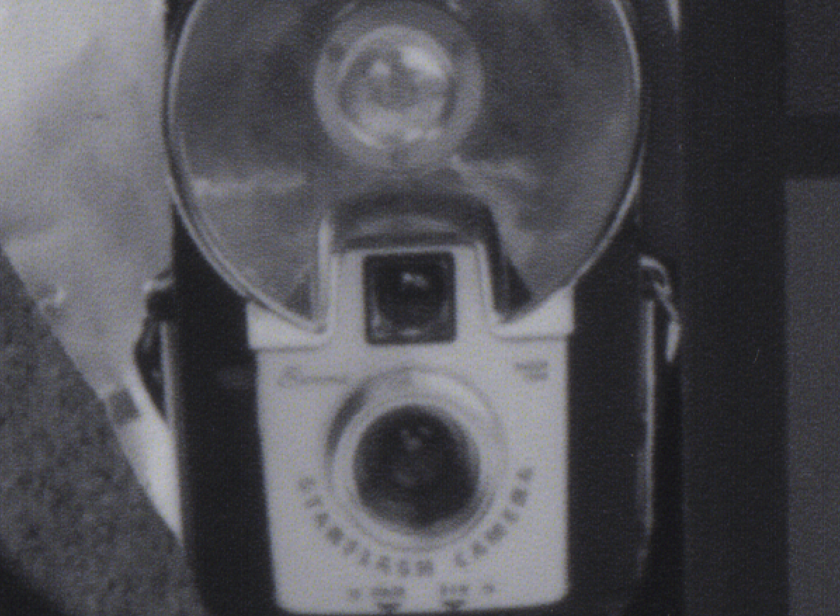
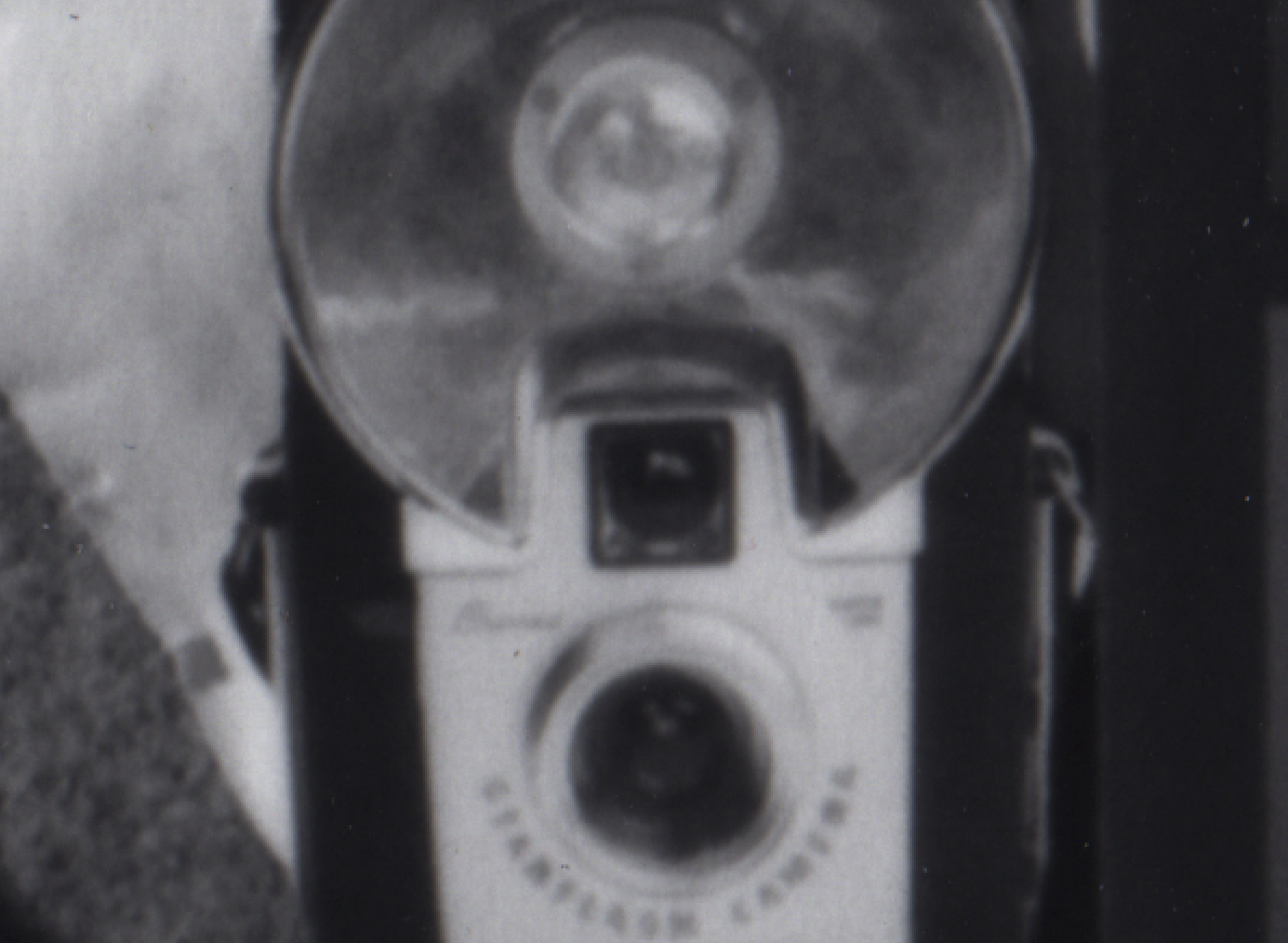
Here's what I saw, at just 200%.
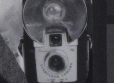
The inkjet print-
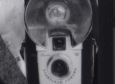
The silver print-
The Epson print, at just a 600 dpi scan and 200% shows significant banding, and dots of ink. I can even, in the original TIFF, see color fringing in the scan... effectively, noise, generated by the inevitable introduction of color to the inks, to neutralize the tones. The print appears sharper, but in reality it's simply the result of the dot-pitch giving the appearance of edges. (Remember how Tri-X makes a slightly blurry shot look OK, because of the grain? Same thing...)
The silver print is, fundamentally, a continuous tone print. End of story, and you can see it very clearly in these samples.
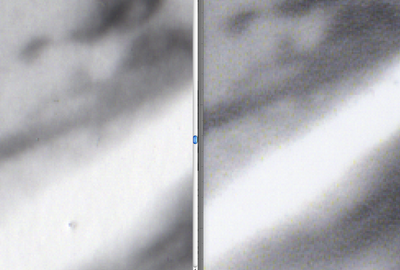
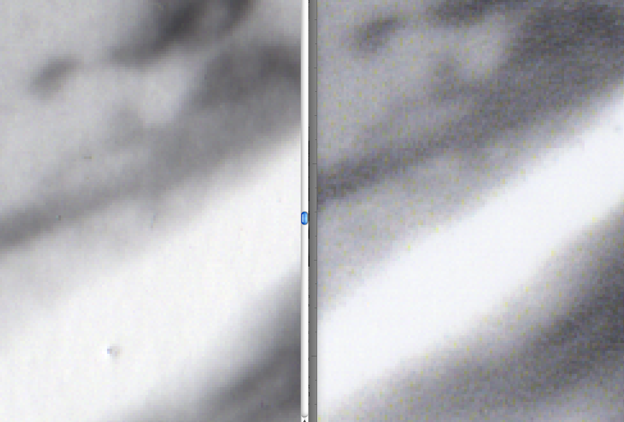
This got me going... the highlight transitions are one place where you can clearly see a break- a distinct line where you get ink dots and not, even with the eye at normal viewing distances. Above is a pretty startling comparison (silver on left, inkjet on right). The silver print has a smooth transition, the inkjet a clear line. (You can even see the color aliasing in this one.)
Does this matter? Ultimately, you have to decide for yourself. I've seen some comparisons done, notably
Tyler Boley's work, here, doing ultra-high resolution scans of similar prints, and as thorough as to print several samples, using RIPS and quad-tone inks... My doubts were that such a high-resolution, detailed look, "pixel-peeping" to the extreme, probably were, well,
too extreme. If you can't actually see a difference, then it's academic.
The point of my exercise here was to keep well within the bounds of reason. Can you see the difference with the naked eye? Do the prints
feel different?
My conclusion? Silver rules.
Thanks Eric!
Labels: b/w conversions, b/w printing, inkjet printing, silver prints